Clickfarm · 2013
Harvesters Food Network
Four hundred food-bank pages, spec to comps, resolved into three primary actions.
Read the case studyClickfarm · 2014
Branding for a KC race that had run for years on nothing but its name.

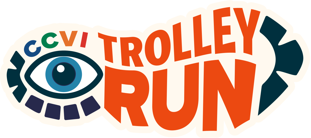
The Trolley Run is a fundraiser for the Children’s Center for the Visually Impaired. Four miles through Brookside and Waldo neighborhoods of Kansas City, every year, and while well-known in the area, it had no brand. Because nobody had a picture in their head of what it should be, the style tiles were a shotgun spread.
Once the client chose a direction, I started with the logo. I was looking at sneaker prints, and a lot of treads have a round element in the middle of them, almost like an eye. An eye, for a race that raises money to help visually impaired kids. More than a decade later, the logo is still in use.
Clickfarm · 2013
Four hundred food-bank pages, spec to comps, resolved into three primary actions.
Read the case studySullivan Higdon & Sink · 2012
A new HVAC tool brand from Newell Rubbermaid, in a market as tribal as Milwaukee vs DeWalt.
Read the case studySullivan Higdon & Sink · 2012
A trade show booth built as a Kinect game that pulled visitors onscreen to fight off zombie sheep.
Read the case study